Oxford Athletic Club Case Study
Oxford Athletic Club (OAC) is a high-end fitness facility in Wexford, PA. A well-known club in the area for three decades, OAC offers numerous high-end amenities such as 14 tennis courts, two outdoor pools, immersive spinning classes, state-of-the-art workout facilities, and more.
Four short years after OAC was acquired and rushed through a rebrand, the website needed a refresh. Our task was to address the current site's major user experience pain points and improve the user experience on all devices.
My Role
UI/UX Design
User Research
Wireframing
Information Architecture
Web Design
Design Systems
Art Direction
Company
PCG Capital
Oxford Athletic Club
Collaborators
Erin Miller
Elayna Kaylor
Emily Davis
Completed
2018
User Research
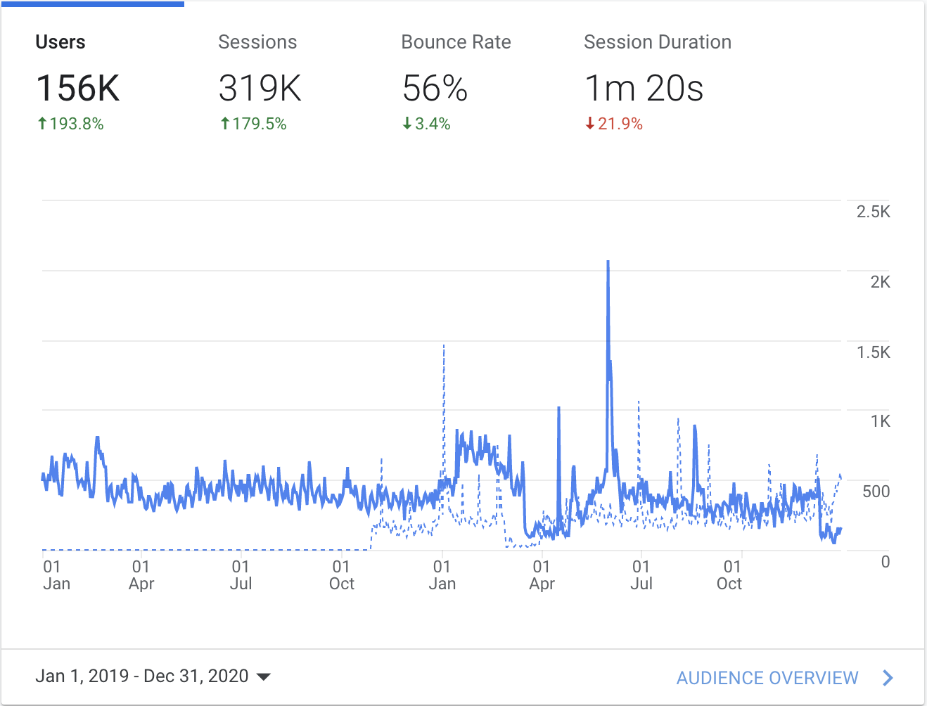
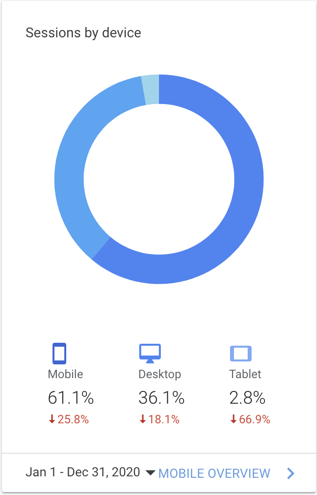
We began the research phase by gathering primary and secondary information through Jotform surveys, WPForms questionnaires, Google Analytics, competitive analysis, and on-site interviews with Oxford Members. This data allowed us to identify and understand the highest-priority pain points for the users on the website at that time.
Define
Users of the Oxford website experienced challenges in locating upcoming events, registering for classes, and finding membership information. To alleviate these problems, we broke them down into three separate issues and targeted them as such.
The three biggest problems:
"We haven't heard about upcoming events" - Current Member
"I'm not sure what offers are available for new members and how to sign up." - New Lead
"I'm not sure how or where to sign up for class" - Current Member
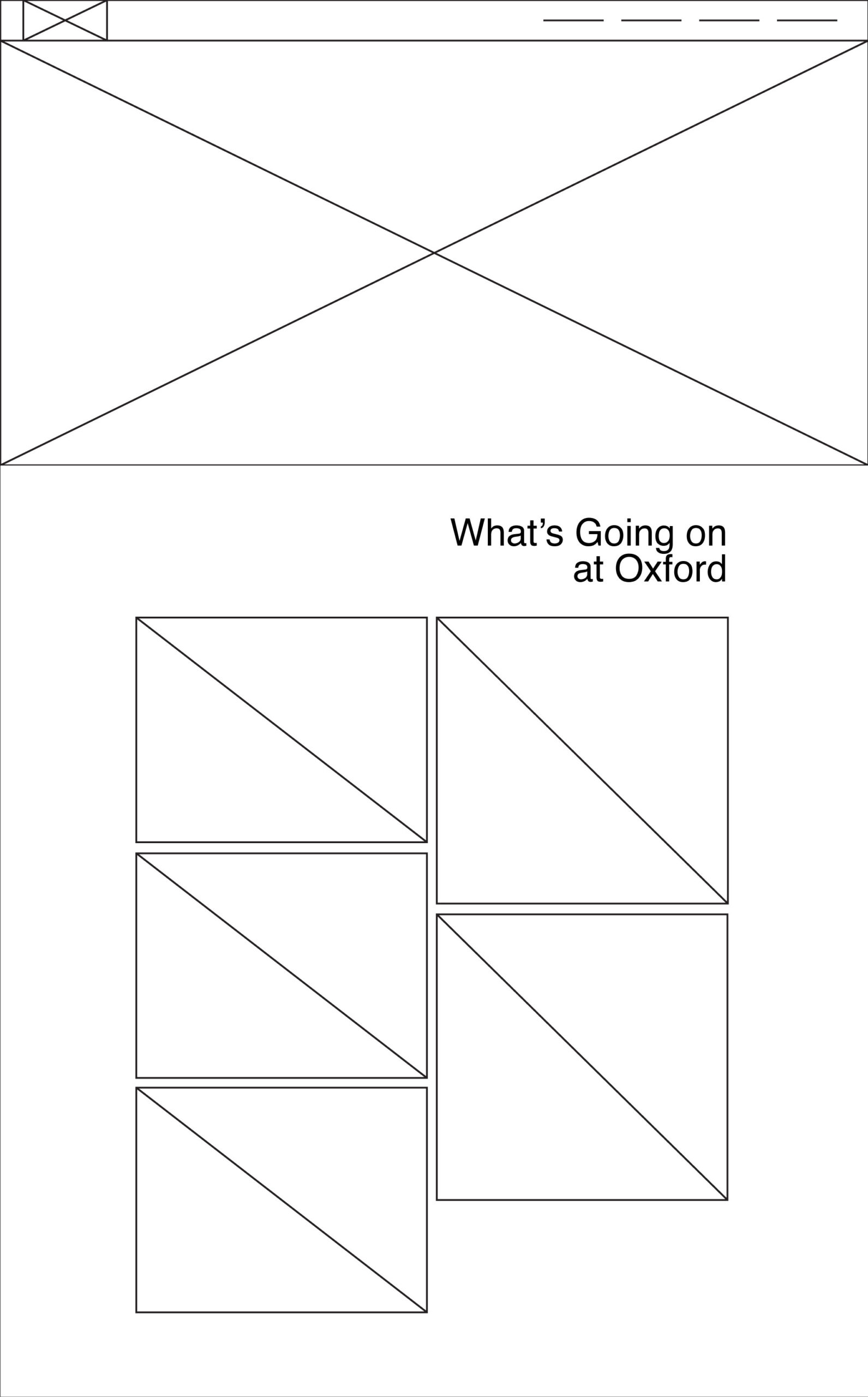
Wireframes
To address these problems stated above, I began wireframing design solutions that would allow the events, class registration, and membership information to be easily accessible.
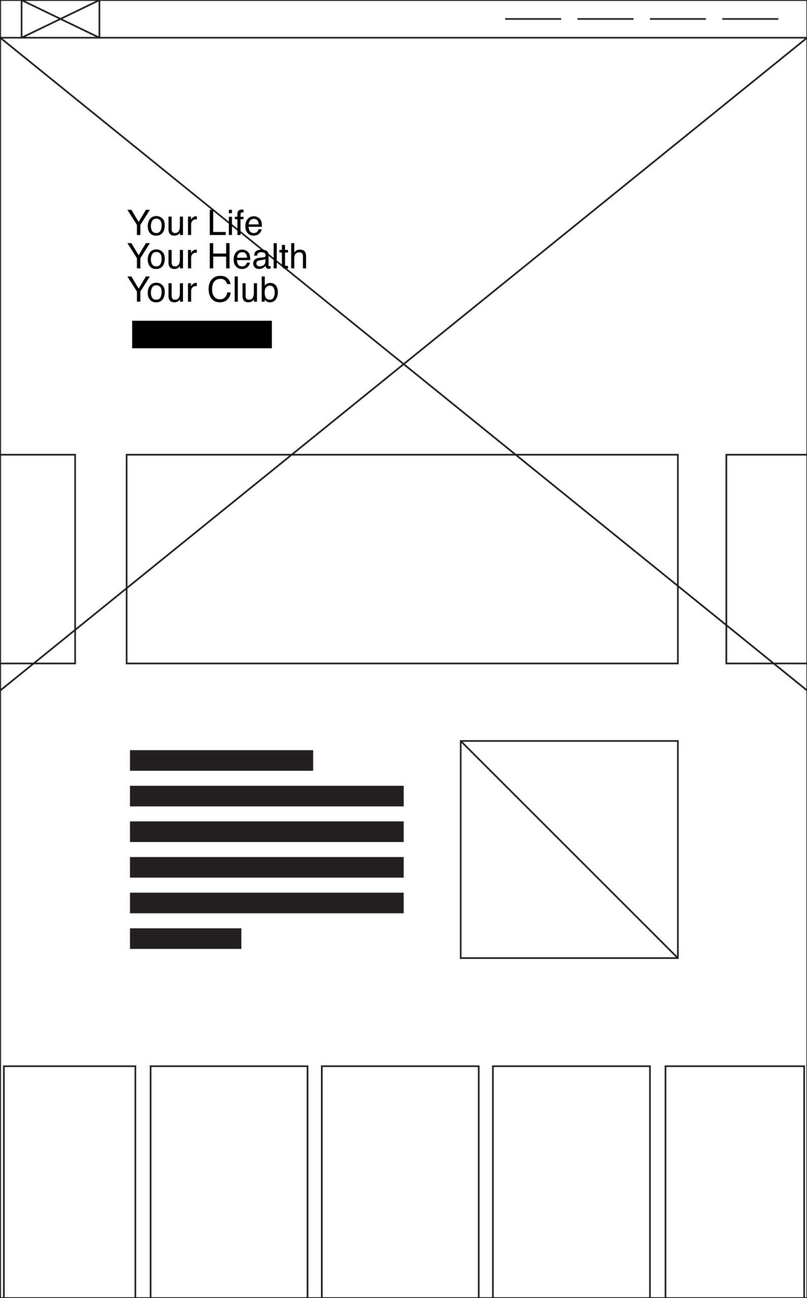
Design Iterations
Now, I started iterating high-fidelity designs that would put the solutions to these issues at the forefront. Both design mockups utilize hero images and simple navigation, which were design features that stakeholders wanted to retain from the current website.
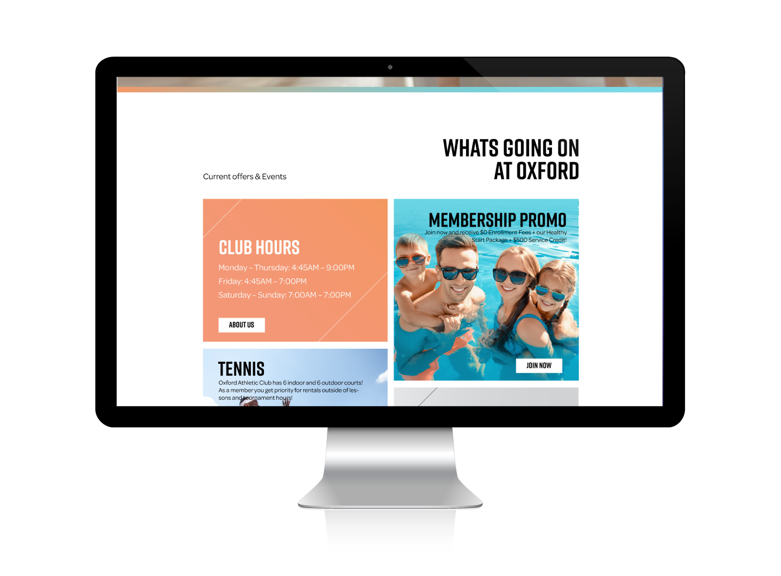
Option 1: On the left, the design features a hero video at the forefront but would still allow for standard fullscreen desktops to have the "What's Going on at Oxford" text and tops of the images to peak out above the fold, drawing the user's eye down the page straight to membership registration/promo and events. On mobile devices, the hero image presents smaller, allowing the "What's Going on at Oxford" header and the events and member content to be the primary feature.
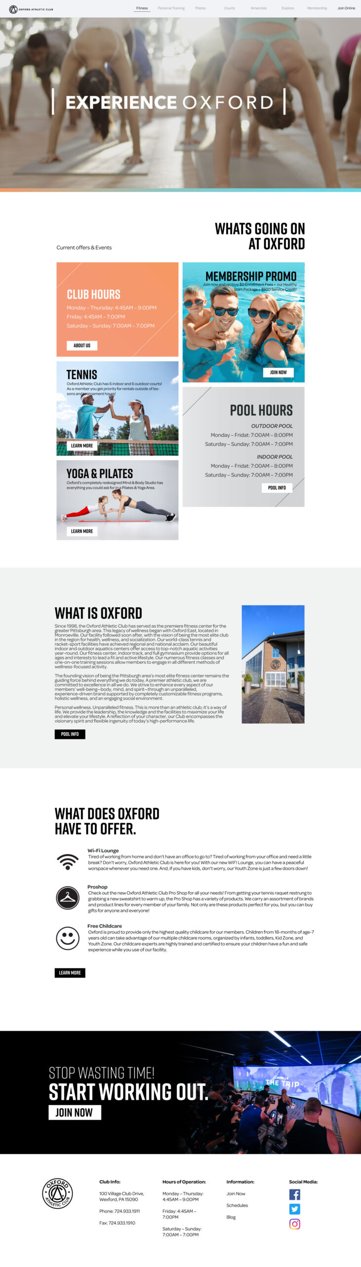
Option 2: On the right, this design option has a static hero image with overlaid events and a promo slider on a standard fullscreen page.
This design makes it easy for users to find information about events and memberships. When viewed on a mobile device, the hero image shrinks,and the slider element becomes a standalone slider navigation.
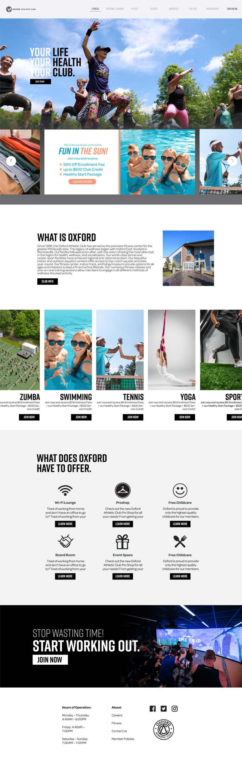
Solution
The final design was a combination of the two designs pulling elements of both to create a unique and elegant design to match the club's aesthetic.
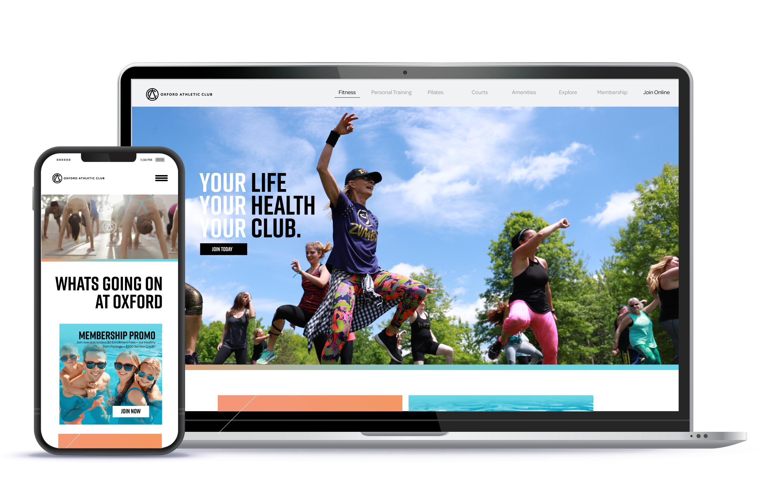
Full Layout
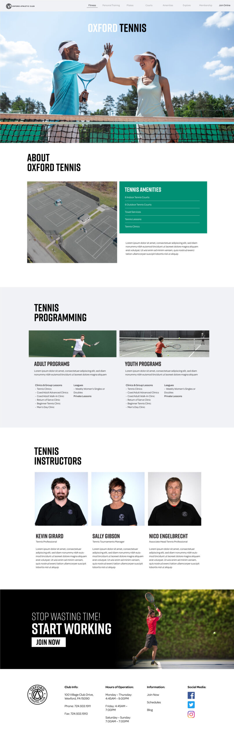
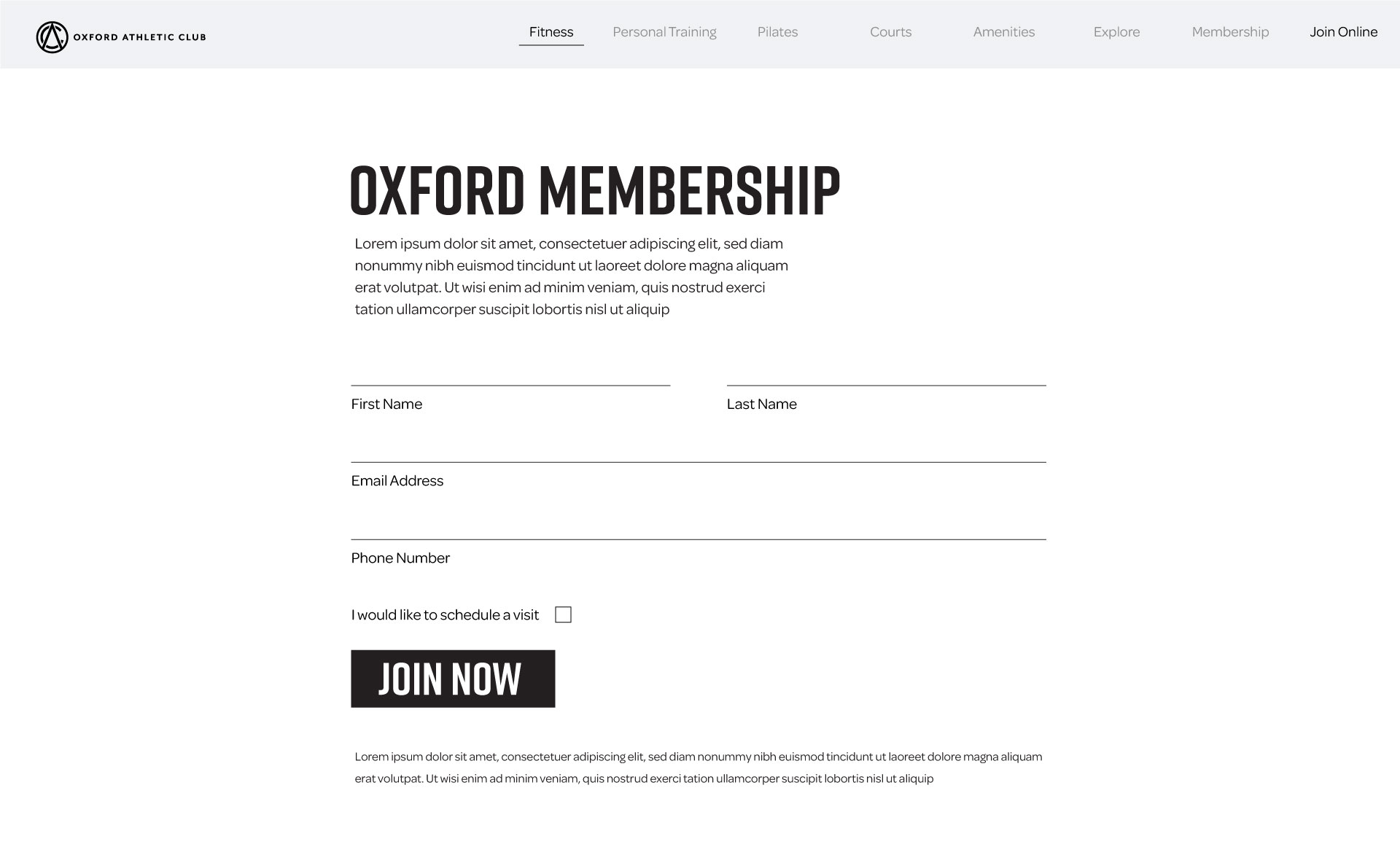
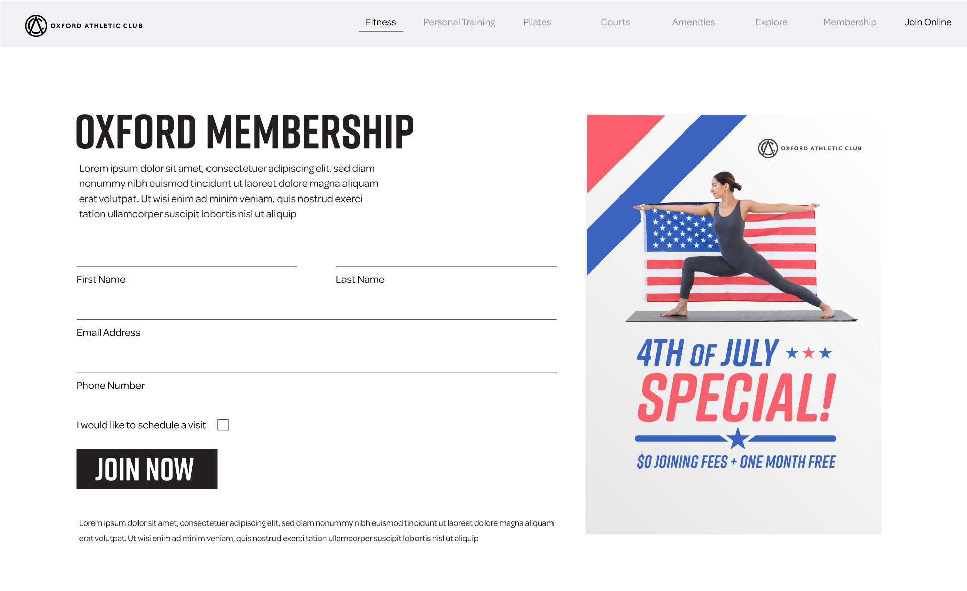
To the left are the mobile and Desktop full home pages. They create multiple navigation points for ease of use. Allowing for various options to get to the same result to account for our vast user bases needs. The registration form below also solves a pivotal issue. The individual landed pages provide all of the information needed for all programs under that sports umbrella as well as simple sign up forms. Multiple signup forms with various promotions caused the site to not only bloat but create tons of confusions for potential customers and where they should register and what they get. This new form is static and should never change as well as confirmation.
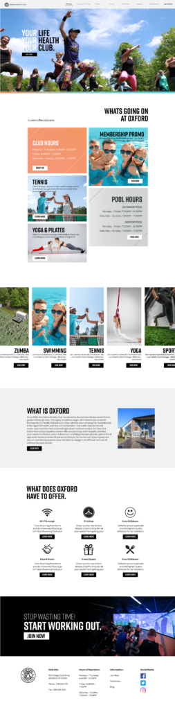

- Problem 1: Upcoming Event's front & Center.
- Problem 2: Membership offers and registration simplified.
- Problem 3: Class registration offered on every landing page.